[You can copy paste! ] How to make a checkbox for material design
It is the 3rd of the Material Design series!
Click here for past articles.
- [You can copy paste!] How to make a button for material design
- [You can copy paste! ] How to create a text field for material design
This time, I will introduce how to make a checkbox.
Now, I will post the source code immediately.
HTML
<html>
<head>
<style>
.md-checkbox-label {
display: block;
margin-bottom: 1rem;
}
.md-checkbox-ul {
margin: 0;
padding: 0;
list-style: none;
}
.md-checkbox-ul > li {
position: relative;
display: flex;
align-items: center;
margin-bottom: 1rem;
}
.md-checkbox-checkbox {
display: none;
}
.md-checkbox-checkbox + label {
position: relative;
padding-left: 2rem;
}
.md-checkbox-checkbox + label::before {
content: '';
display: block;
box-sizing: border-box;
position: absolute;
top: 4px;
left: 2px;
width: 16px;
height: 16px;
border: 2px solid #9E9E9E;
border-radius: 2px;
transition: 0.15s;
}
.md-checkbox-checkbox + label::after {
content: '';
display: block;
box-sizing: border-box;
position: absolute;
top: 11px;
left: 3px;
width: 0;
height: 0;
transform: rotate(-45deg);
transform-origin: left top;
border-left: 2px solid #FFF;
border-bottom: 2px solid #FFF;
visibility: hidden;
}
.md-checkbox-ripple {
position: absolute;
top: -8px;
left: -10px;
width: 40px;
height: 40px;
border-radius: 50%;
background-color: #6300ee98;
transform: scale(0);
}
.md-checkbox-checkbox:checked ~ .md-checkbox-ripple {
animation: ripple .4s linear;
}
.md-checkbox-checkbox:checked + label::before {
border: 8px solid #6200ee;
}
.md-checkbox-checkbox:checked + label::after {
animation: md-checkbox-anim .3s forwards;
}
@keyframes ripple {
to {
transform: scale(1);
opacity: 0;
}
}
@keyframes md-checkbox-anim {
0% {
visibility: visible;
width: 0;
height: 0;
}
40% {
visibility: visible;
width: 0;
height: 8px;
}
100% {
visibility: visible;
width: 12px;
height: 8px;
}
}
body {
display: flex;
justify-content: center;
align-items: center;
background-color: #F5F5F5;
}
</style>
</head>
<body>
<div>
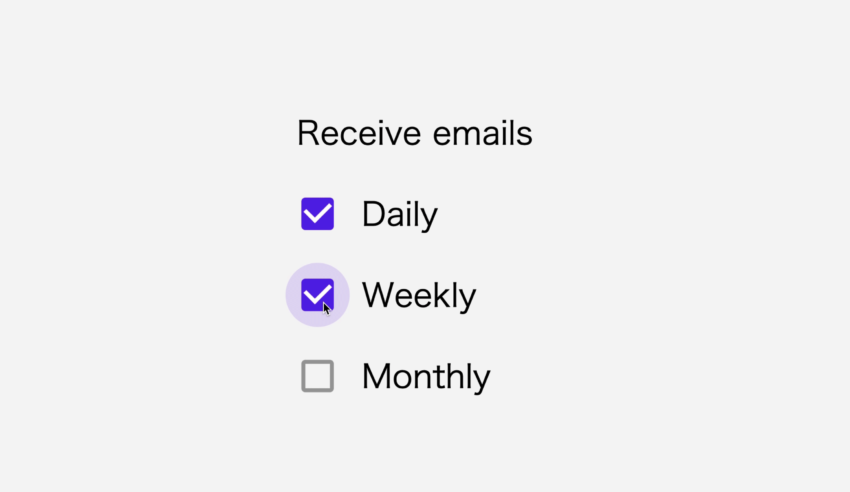
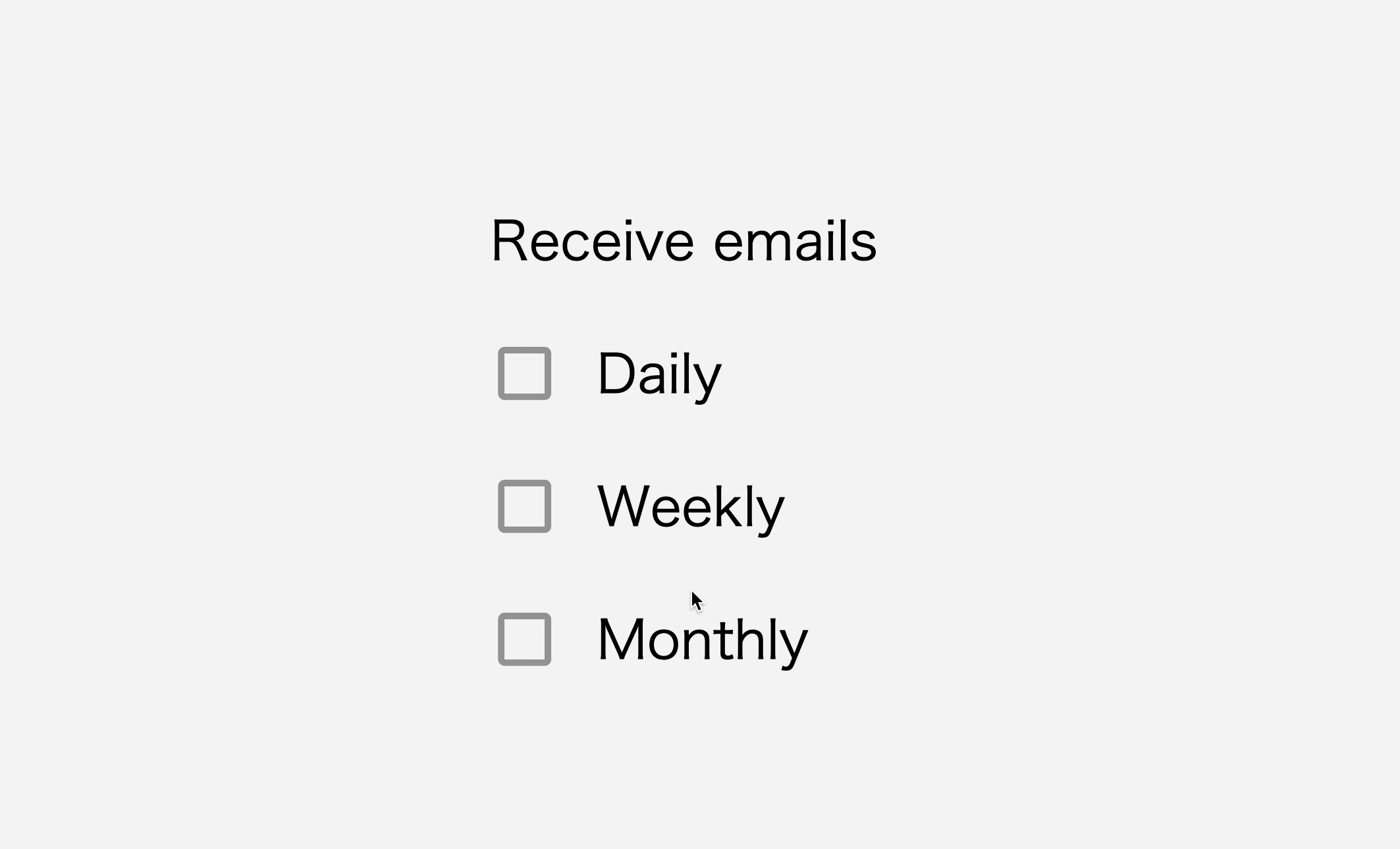
<span class="md-checkbox-label">Receive emails</span>
<ul class="md-checkbox-ul">
<li>
<input type="checkbox" id="daily" class="md-checkbox-checkbox">
<label for="daily">Daily</label>
<span class="md-checkbox-ripple"></span>
</li>
<li>
<input type="checkbox" id="weekly" class="md-checkbox-checkbox">
<label for="weekly">Weekly</label>
<span class="md-checkbox-ripple"></span>
</li>
<li>
<input type="checkbox" id="monthly" class="md-checkbox-checkbox">
<label for="monthly">Monthly</label>
<span class="md-checkbox-ripple"></span>
</li>
</ul>
</div>
</body>
</html>
Let’s take a go below.
HTML
HTML
<div>
   <span class="md-checkbox-label">Receive emails</span>
   <ul class="md-checkbox-ul">
      <li>
         <input type="checkbox" id="daily" class="md-checkbox-checkbox">
         <label for="daily">Daily</label>
         <span class="md-checkbox-ripple"></span>
      </li>
      <li>
         <input type="checkbox" id="weekly" class="md-checkbox-checkbox">
         <label for="weekly">Weekly</label>
         <span class="md-checkbox-ripple"></span>
      </li>
      <li>
         <input type="checkbox" id="monthly" class="md-checkbox-checkbox">
         <label for="monthly">Monthly</label>
         <span class="md-checkbox-ripple"></span>
      </li>
   </ul>
</div>
I haven’t done anything special.
The top span tag is set to the group name of the checkboxes, and the ul tag below them is a list of checkboxes.
The li tag becomes a one-line element, including a checkbox (input type=”checkbox”), the corresponding item name (label tag), and a ripple effect (span tag) that appears when checked.
By setting the ‘id’ name of the input tag to the ‘for’ attribute of the label tag, you can turned ON and OFF checkbox when click the label. As will be described later, this setting is important for switching checkbox.
CSS
CSS
.md-checkbox-label {
   display: block;
   margin-bottom: 1rem;
}
This Class is for the name of the group of checkboxes. I’m setting ‘margin-bottom’ to make a little more distance from the checkbox list below it. And also setting ‘display: block’ to make ‘margin-bottom’ work because span tag is inline element. ‘margin-top’ and ‘margin-bottom’ doesn’t work with inline element.
CSS
.md-checkbox-ul {
   margin: 0;
   padding: 0;
   list-style: none;
}
.md-checkbox-ul > li {
   position: relative;
   display: flex;
   align-items: center;
   margin-bottom: 1rem;
}
This is List of checkboxes.
The ul tag usually has a black circle on the left side, but it was not needed, so I erased it with list-style: none.
Margin and padding are also set to 0 to fill the black circle space.
You may not need to write like this if you have ‘Reset CSS’.
‘ul > li’ means that style for li tag directly under ul tag.
I’m setting ‘display: flex’ and ‘align-items’ because wanted to centering vertically, and setting ‘margin-bottom’ because wanted to space between checkboxes.
The reason for using ‘position: relative’ to make the relative placement is that the checkboxes and ripple marks created in this tag are absolutely positioned by ‘position: absolute’.
It is a setting to start from the li tag.
CSS
.md-checkbox-checkbox {
   display: none;
}
.md-checkbox-checkbox + label {
   position: relative;
   padding-left: 2rem;
}
The default checkbox created with input tags does not let you design as you like.
Therefore let’s remove this checkbox with ‘display: none’.
Well, how do you make the checkbox work?
The answer is in the label tag placed next to the input tag.
As I wrote in the HTML description, the label tag and the input tag are tied together by set ‘id’ name of the input tag to the ‘for’ attribute of the label tag.You can turn the check ON and OFF by clicking on the label tag.
So where did the checkbox go?
Checkboxes are created with pseudo-elements of label tags.
CSS
.md-checkbox-checkbox + label::before {
   content: '';
   display: block;
   box-sizing: border-box;
   position: absolute;
   top: 4px;
   left: 2px;
   width: 16px;
   height: 16px;
   border: 2px solid #9E9E9E;
   border-radius: 2px;
   transition: 0.15s;
}
‘+’ is called an adjacent selector.
‘A + B’ means B element next to the A element. B must be behind A.
In the above case, it is a style about the label tag next to the input tag with the ‘md-checkbox-checkbox’ class set, but it was wrote ‘label::before’.
‘::before’ is called pseudo-element. It means that creates a pseudo element before the tag.
Create a pseudo element before the label tag.
This time, I’m making a checkbox frame with the ‘::before’ pseudo-element.
I’m setting empty character to ‘content’ because characters are not need. And setting ‘display: block’ because want to make a block element.
By ’box-sizing: border-box’, ‘width’ and ‘height’ include border size.
Let’s take a look from ‘position’ to ‘height’ at once, ‘width’ and ‘height’ are make checkbox frame of 16px vertically and horizontally.
I want to set the placement freely, so use ‘position: absolute’. By setting ‘top: 4px’ and ‘left: 2px’, it is placed at a distance of 4px from the top of the li tag and 2px from the left.
By setting ‘border’, thickness of border is 2px and color is gray.
By setting ‘border-radius’, rounding the corners a bit.
By setting ‘transition: 0.15s’, The background color when checked is set to be painted in 0.15 seconds.
CSS
.md-checkbox-checkbox + label::after {
   content: '';
   display: block;
   box-sizing: border-box;
   position: absolute;
   top: 11px;
   left: 3px;
   width: 0;
   height: 0;
   transform: rotate(-45deg);
   transform-origin: left top;
   border-left: 2px solid #FFF;
   border-bottom: 2px solid #FFF;
   visibility: hidden;
}
Same way as ‘::before’, ‘::after’ means to add a pseudo-element after the label tag.
‘::after’ creates check mark inside the frame.
How does ‘::after’ create a check mark?
The answer is the square box is tilted 45 degrees and to show only the left and bottom lines of the box.
By setting ‘transform : rotate (-45dig)’, tilted 45 degrees counterclockwise, and by setting ‘border-left’ and ‘border-bottom’, the left and bottom lines are white lines with a thickness of 2px.
Also, I want to keep it hidden until the check is made, so I set ‘visibility: hidden’.
CSS
.md-checkbox-ripple {
   position: absolute;
   top: -8px;
   left: -10px;
   width: 40px;
   height: 40px;
   border-radius: 50%;
   background-color: #6300ee98;
   transform: scale(0);
}
This creates ripples element when checked.
By setting ‘width’, ‘height’, and ‘border-radius’, make a perfect circle of 40px.
I want to keep it hidden until the checked, so I set ‘transform: scale(0)’.
Now you have the base for the checkbox. From here, create the effect when checked. Let’s see below.
CSS
.md-checkbox-checkbox:checked ~ .md-checkbox-ripple {
   animation: ripple .4s linear;
}
@keyframes ripple {
   to {
      transform: scale(1);
      opacity: 0;
   }
}
Here, I’m creating an effect of ripples that appear when checked.
It’s calling a ripple animation named ripple, and increase the zoom from 0 to 1x in 0.4 seconds, while gradually making it transparent.
CSS
.md-checkbox-checkbox:checked + label::before {
   border: 8px solid #6200ee;
}
Paint the color in the frame when checked.
I could have erased border and painted background color, but there was a little flicking in switching between on /off the check, so I set a slightly thicker border and painted it.
CSS
.md-checkbox-checkbox:checked + label::after {
   animation: md-checkbox-anim .3s forwards;
}
@keyframes md-checkbox-anim {
   0% {
      visibility: visible;
      width: 0;
      height: 0;
   }
   40% {
      visibility: visible;
      width: 0;
      height: 8px;
   }
   100% {
      visibility: visible;
      width: 12px;
      height: 8px;
   }
}
It is set check mark when checked.
Running animation named ‘md-checkbox-anim’ in 0.3 seconds.
In addition, by setting ‘forwards’, the state after animation (check ON state) is maintained.
When the animation progresses to 40%, a line is drawn from left to bottom,
and a line is drawn from the bottom to the upper right by expanding the width.
Summary
The default checkbox(input type=”checkbox”) does not design,
so if you want to design your own like this, you will make it with ‘pseudo-element’ after hide default checkbox.
If you think ‘Ordinary checkboxes are boring!’, try it.
Shitakke!
- Hide default checkbox with ‘display: none’.
- Create checkbox frame with ‘::before’pseudo-element.
- Create check mark with ‘::after’pseudo-element.
- Check mark is made with that left and bottom lines on box that tilted 45 degrees.
本格的にプログラミングを学びたいですか?ITのエンジニアになりたいですか?
IT業界は万年人手不足であり、ニーズがあります。
パソコンとインターネットがあれば場所を問わず仕事ができるので、リモートワークが普及しつつある現代にマッチした職種と言えると思いますし、
物理的に必要なものはパソコンぐらいなので初期投資にかかる費用も少なく、人並みに仕事ができればフリーランスになって会社依存を脱却することもできます。
身につけた技術は一生モノです。
もし本腰を入れて勉強したいという方はスクールに入るのも一つの手です。
いくつか紹介しますので、興味があればサイトを覗いてみてください。
TechAcademy
最短4週間で未経験からプロを育てるオンライン完結のスクールです。 どこかに通う必要なく、自宅でもプログラミングやアプリ開発を学ぶことができます。
TechAcademyのサイトへ
Want to learn programming in earnest? Want to be an IT engineer?
The IT industry is understaffed for many years and has needs.
If you have a computer and the Internet, you can work anywhere,
so I think it can be said that it is a job type that matches the present age when remote work is becoming widespread.
The initial investment cost is low, and if you can work like a normal person, you can become freelance and get rid of your dependence on the company.
The skills that you have acquired is something that will last a lifetime.
If you want to study in earnest, you can go to school.
I will introduce some of them, so if you are interested, please take a look at the site.
DMM WEBCAMP
This is a programming school for those who are serious about changing jobs. guarantee a job change, so it is recommended for those who are inexperienced and are looking for a job change in the IT industry!
move to DMM WEBCAMP
TechAcademy
It is an online school that trains professionals from inexperienced in a minimum of 4 weeks. You can learn programming and app development at home without having to go anywhere.
move to TechAcademy