[You can copy paste! ] How to create a text field for material design
Continuing from the previous “[You can copy paste!] How to make a button for material design“, I introduce how to make a text field.
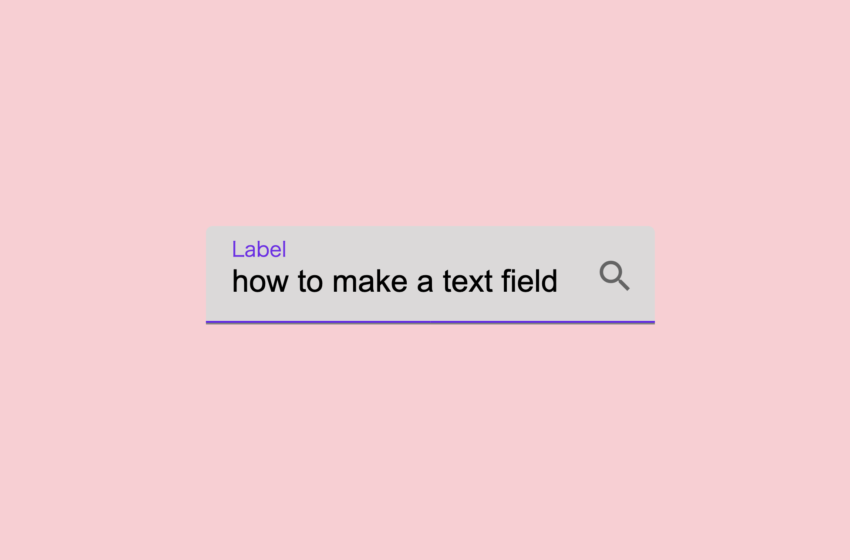
The sample is posted here, so I will try to reproduce this somehow.
The full amount of source code is here.
HTML
<html>
<head>
<link href="https://fonts.googleapis.com/icon?family=Material+Icons" rel="stylesheet">
<style>
.md-text-wrapper {
position: relative;
}
.md-text-input {
border: none;
outline: none;
font-size: 18px;
padding: 22px 40px 13px 15px;
border-radius: 4px 4px 0 0;
border-bottom: 1px solid rgba(0,0,0,.42);
background-color: #f5f5f5;
}
.md-text-input:hover {
background-color: #eeeded;
}
.md-text-input:focus {
background-color: #dbd9d9;
}
.md-text-label {
position: absolute;
left: 15px;
top: 16px;
color: #999;
font-size: 18px;
pointer-events: none;
transition: 0.2s ease all;
}
.md-text-input:focus ~ .md-text-label,
.md-text-input:required:valid ~ .md-text-label {
top: 4px;
color: rgba(98, 0, 238, 0.87);
font-size: 12px;
}
.md-text-bar {
position: relative;
display: block;
width: 100%;
}
.md-text-bar:before,
.md-text-bar:after {
content: '';
height: 1px;
width: 0;
bottom: 1px;
position: absolute;
background: #6200ee;
transition: 0.2s ease all;
}
.md-text-bar:before {
left: 50%;
}
.md-text-bar:after {
right: 50%;
}
.md-text-input:focus ~ .md-text-bar:before,
.md-text-input:focus ~ .md-text-bar:after {
width: 50%;
}
.md-text-icon {
background-color: transparent;
border: none;
outline: none;
appearance: none;
cursor: pointer;
position: absolute;
bottom: 15px;
right: 5px;
color: rgba(0,0,0,.54);
}
body {
display: flex;
justify-content: center;
align-items: center;
}
</style>
<script>
window.onload = function() {
const button = document.getElementById('myicon')
button.addEventListener('click', onClickIcon)
}
function onClickIcon(event) {
console.log('clicked icon')
}
</script>
</head>
<body>
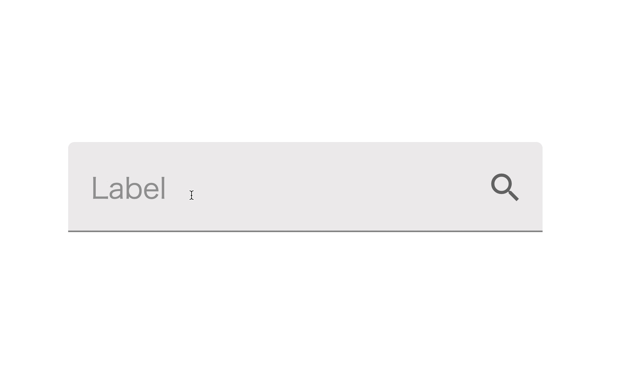
<div class="md-text-wrapper">
<input type="text" class="md-text-input" required>
<span class="md-text-bar"></span>
<label class="md-text-label">Label</label>
<button id="myicon" class="md-text-icon">
<i class="material-icons">search</i>
</button>
</div>
</body>
</html>
Let’s take a go below.
HTML
HTML
<div class="md-text-wrapper">
   <input type="text" class="md-text-input" required>
   <span class="md-text-bar"></span>
   <label class="md-text-label">Label</label>
   <button id="myicon" class="md-text-icon">
       <i class="material-icons">search</i>
   </button>
</div>
It’s a single text field on the screen, but you can see that it combines several tags.
input tag
Input form. Enter a character here. For normal text fields, this tag is sufficient.
span tag
An underline that extends from the center to the edge when you click on a text field.
label tag
Item name. When not entered, it is displayed in the center, but when inputting or already entered, it becomes tiny and moves up.
button tag
It is a button that displayed on the right side of the input field. If you don’t need it, you can erase it.
i tag
It’s a button icon. As an example, I used the search icon provided in the Material Icon.
If you give the i tag the class name material-icons and write text that matches the icon, an icon will be displayed.
Also, to use the material icon, you need to load the following:
HTML
<link href="https://fonts.googleapis.com/icon?family=Material+Icons" rel="stylesheet">
CSS
CSS
.md-text-wrapper {
   position: relative;
}
Each tag that makes up the text field is grouped by a div tag with a class called ‘md-text-wrapper’.
Since item names and icons are absolutely positioned by ‘position: absolute’, ‘position: relative’ is set here so that they do not protrude from the parent div tag.
CSS
.md-text-input {
   border: none;
   outline: none;
   font-size: 18px;
   padding: 22px 40px 13px 15px;
   border-radius: 4px 4px 0 0;
   border-bottom: 1px solid rgba(0,0,0,.42);
   background-color: #f5f5f5;
}
.md-text-input:hover {
   background-color: #eeeded;
}
.md-text-input:focus {
   background-color: #dbd9d9;
}
The ‘md-text-input’ is the class for the input tag.
Setting “none” to ‘border’ and ‘outline’, I erase extra borders. If you have reset CSS, you may not need this.
Padding set the inner margins of the input field. 22px on the top, 40px on the right, 13px at the bottom and 15px on the left.
Setting ‘border-radius’, I round the upper right and upper left corners a little. I don’t want to round the lower right and lower left, so I set it to 0.
‘border-bottom’ represents an underline in the input field, but it is not a thick underline that appears as you type. It is a gray underline that appears when you are not touching it.
The background color is gray(#f5f5f5) but when you hover over it, it becomes a little darker(#eeeded),and when you click to edit it, it becomes more darker(#dbd9d9).
CSS
.md-text-label {
   position: absolute;
   left: 15px;
   top: 16px;
   color: #999;
   font-size: 18px;
   pointer-events: none;
   transition: 0.2s ease all;
}

.md-text-input:focus ~ .md-text-label,
.md-text-input:required:valid ~ .md-text-label {
   top: 4px;
   color: rgba(98, 0, 238, 0.87);
   font-size: 12px;
}
This is the style setting of the label tag that displays the item name.
Since it is displayed as if it were covered above the input tag, it is absolutely positioned with ‘position: absolute’.
Positioned with ‘left’ and ‘top’.
I have set ‘pointer-events: none’ to disable click events on label.
Without it, clicking on the label will not activate the input field. If you click on the label avoiding it, it will be activated, but it is inconvenient for the user, so I disable the click on the label so that the input tag is clicked.
When the input tag is clicked, label becomes smaller and moves up. The movement speed is set at the ‘transition’.
You may not be familiar with the ‘~’ at ‘.md-text-input:focus ~ .md-text-label’.
“A ~ B” means the style for the B element in the same hierarchy that follows the A element.
So it is a style for the label tag in the same hierarchy when the input tag clicked.
Also, ‘:required’ at ‘.md-text-input:required:value ~.md-text-label’ means a pseudo-class with a required attribute, and ‘:vald’ means a correctly entered tag.
Both apply the same style. What I want to do here is to make the label a little smaller, shifting it upwards, change color, when the input tag is clicked or entered in the input field.
CSS
.md-text-bar {
   position: relative;
   display: block;
   width: 100%;
}
.md-text-bar:before,
.md-text-bar:after {
   content: '';
   height: 1px;
   width: 0;
   bottom: 1px;
   position: absolute;
   background: #6200ee;
   transition: 0.2s ease all;
}
.md-text-bar:before {
   left: 50%;
}
.md-text-bar:after {
   right: 50%;
}

.md-text-input:focus ~ .md-text-bar:before,
.md-text-input:focus ~ .md-text-bar:after {
   width: 50%;
}
This is an underlined style that extends when you click the input tag.
I express underline with span tag, but you can’t see because there’s no text between span tag.
So where is that expanding underline? The answer is pseudo-element(:before, :after).
‘:before’ means to create a pseudo element before the specified element.
‘:after’ means to create a pseudo element behind the specified element.
The underline spreads from the center to the left edge and the right edge.
‘:before’ creates an underline that extends to the left edge from center.
‘:after’ creates an underline that extends to the right edge from center.
Looking at them one by one,
First, the span tag is changed from an inline element to a block element by setting ‘display: block’.
And ‘width: 100%’ to make it as wide as the width of the input tag.
‘: before’ and’: after’ are basically the same style.
‘content’ means the character to display, but this time setting empty because I just want to show underline only, character is not needed.
‘height: 1px’ is underline height.
‘width: 0’ means the underline width is 0px. In other words, it is not visible in the initial state.
‘position: absolute’ and ‘bottom: 1px’ will draw a line from under the input tag to a location of 1px.
The starting position is set to the center of the input tag by setting “left: 50%” to the ‘:before’ and “right: 50%” to the ‘:after’.
By the last “md-text-input:focus ~ .md-text-bar:before” and “md-text-input:focus ~ .md-text-bar:after”,
when the input tag is clicked, ‘:before’ fills the left half and ‘:after’ fills the right half.
Since transition is set to 0.2 seconds, it takes 0.2 seconds to animate from the center to the edge.
JavaScript
JavaScript
window.onload = function() {
   const button = document.getElementById('myicon')
   button.addEventListener('click', onClickIcon)
}

function onClickIcon(event) {
   console .log ('clicked icon')
}
This is just set so that the ‘onClickIcon’ function is called when the icon is clicked.
If you want to do something, implement it as you like in the ‘onClickIcon’ function.
Summary
That’s how to create a text field for material design.
I think that it is fashionable and easy to see, but if you give a difficult point, this input field needs more height than usual input form.
When I took it in a project, customer told me that “I want to pack more information on the screen” and I almost cried.
After that, it is made by making full use of various tags, so the source code tends to be complicated.
If it is a page that requires a lot of input fields, it seems to be a little miserable.
If you can adopt a framework such as Vue.js, it is better to make the above source code a component and devise such as calling it.
The design of the input field is not limited to this, but if you are interested, please refer to the above source code and adjust it as necessary.
Shitakke!
本格的にプログラミングを学びたいですか?ITのエンジニアになりたいですか?
IT業界は万年人手不足であり、ニーズがあります。
パソコンとインターネットがあれば場所を問わず仕事ができるので、リモートワークが普及しつつある現代にマッチした職種と言えると思いますし、
物理的に必要なものはパソコンぐらいなので初期投資にかかる費用も少なく、人並みに仕事ができればフリーランスになって会社依存を脱却することもできます。
身につけた技術は一生モノです。
もし本腰を入れて勉強したいという方はスクールに入るのも一つの手です。
いくつか紹介しますので、興味があればサイトを覗いてみてください。
TechAcademy
最短4週間で未経験からプロを育てるオンライン完結のスクールです。 どこかに通う必要なく、自宅でもプログラミングやアプリ開発を学ぶことができます。
TechAcademyのサイトへ
Want to learn programming in earnest? Want to be an IT engineer?
The IT industry is understaffed for many years and has needs.
If you have a computer and the Internet, you can work anywhere,
so I think it can be said that it is a job type that matches the present age when remote work is becoming widespread.
The initial investment cost is low, and if you can work like a normal person, you can become freelance and get rid of your dependence on the company.
The skills that you have acquired is something that will last a lifetime.
If you want to study in earnest, you can go to school.
I will introduce some of them, so if you are interested, please take a look at the site.
DMM WEBCAMP
This is a programming school for those who are serious about changing jobs. guarantee a job change, so it is recommended for those who are inexperienced and are looking for a job change in the IT industry!
move to DMM WEBCAMP
TechAcademy
It is an online school that trains professionals from inexperienced in a minimum of 4 weeks. You can learn programming and app development at home without having to go anywhere.
move to TechAcademy