[You can copy paste! ] How to make a button for material design
This time, I will introduce how to make a button that is used on the material design website.
Material design is a guideline for design methods proposed by Google.
It is one of the expression methods to make the screen easy for the user.
For example, you can express like real world By apply effects such as shadow to the screen and make up depth or overlap.
Google set rules for making UI parts of material design.
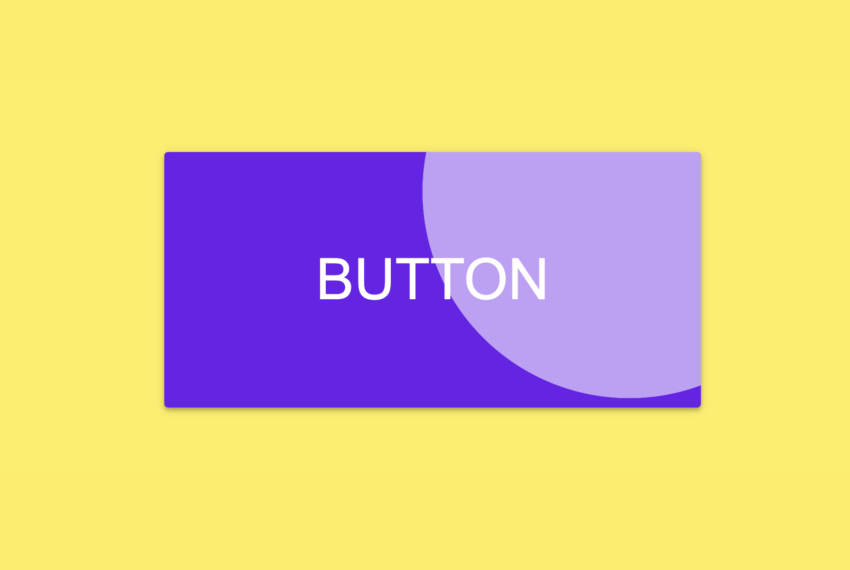
This time, I will introduce how to make a button that when click it the effect of the ripples appears like this:
Google has a sample here.
Well, let’s see the source code below.
If you are in a hurry, copy this:
HTML
<html>
<head>
<style>
.md-button {
box-sizing: border-box;
border: none;
outline: none;
cursor: pointer;
color: white;
background-color: #6200ee;
padding: 10px 16px;
border-radius: 4px;
box-shadow: 0px 3px 1px -2px rgba(0, 0, 0, 0.2),0px 2px 2px 0px rgba(0, 0, 0, 0.14),0px 1px 5px 0px rgba(0,0,0,.12);
transition: box-shadow 280ms cubic-bezier(0.4, 0, 0.2, 1);
position: relative;
overflow: hidden;
}
.md-button:hover, .md-button:focus {
background-color: #6d11ec;
box-shadow: 0px 2px 4px -1px rgba(0, 0, 0, 0.2),0px 4px 5px 0px rgba(0, 0, 0, 0.14),0px 1px 10px 0px rgba(0,0,0,.12);
}
.md-button:active {
background-color: #8d4beb;
box-shadow: 0px 5px 5px -3px rgba(0, 0, 0, 0.2),0px 8px 10px 1px rgba(0, 0, 0, 0.14),0px 3px 14px 2px rgba(0,0,0,.12);
}
span.ripple {
position: absolute;
border-radius: 50%;
transform: scale(0);
animation: ripple 600ms linear;
background-color: rgba(255, 255, 255, 0.7);
}
@keyframes ripple {
to {
transform: scale(4);
opacity: 0;
}
}
body {
background-color: #FFEE58;
}
div {
width: 100vw;
height: 100vh;
display: flex;
justify-content: center;
align-items: center;
}
</style>
<script>
window.onload = function() {
const button = document.getElementById('mybutton')
button.addEventListener('click', createRipple)
}
function createRipple(event) {
const button = event.currentTarget
const diameter = Math.max(button.clientWidth, button.clientHeight)
const radius = diameter / 2
const circle = document.createElement('span')
circle.style.width = `${diameter}px`
circle.style.height = `${diameter}px`
circle.style.left = `${event.clientX - button.offsetLeft - radius}px`
circle.style.top = `${event.clientY - button.offsetTop - radius}px`
circle.classList.add('ripple')
const ripple = button.getElementsByClassName('ripple')[0]
if (ripple) ripple.remove()
button.appendChild(circle)
}
</script>
</head>
<body>
<div>
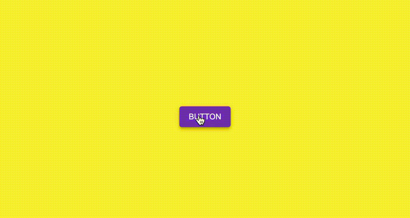
<button id="mybutton" class="md-button">BUTTON</button>
</div>
</body>
</html>
Well, I will explain below.
HTML
HTML
<button id="mybutton" class="md-button">BUTTON</button>
I just prepared the button tag in HTML.
The styling of the button is CSS, and the ripple when clicking is controlled by JavaScript, so that is the main thing.
CSS
I gave the class named ‘md-button’ to the button.
Button’s style is written ‘md-button’ class.
CSS
.md-button {
   box-sizing: border-box;
   border: none;
   outline: none;
   cursor: pointer;
   color: white;
   background-color: #6200ee;
   padding: 10px 16px;
   border-radius: 4px;
   box-shadow: 0px 3px 1px -2px rgba(0, 0, 0, 0.2),0px 2px 2px 0px rgba(0, 0, 0, 0.14),0px 1px 5px 0px rgba(0,0,0,.12);
   transition: box-shadow 280ms cubic-bezier(0.4, 0, 0.2, 1);
   position: relative;
   overflow: hidden;
}
Setting “border-box” to ‘box-sizing’. By doing this, you can include the border and padding width in the button’s width and height.
This setting is not related to material design, but I think you may have a hard time when web page layout if you don’t this. Because ‘width’ and ‘height’ property have not border width and padding width.
This means that if you try to create an element with a width of 100px without ‘box-sizing: border-box’, it can actually exceed 100px.
I think you should specify this for all elements basically.
If you have set it to <body> and <html> etc, you do not need to set it here.
Or rather, you don’t have to do it this time because it deviates from the purpose of this time.
Setting “none” to ‘border’ and ‘outline’. By doing this, I’m trying to prevent extra lines from appearing around the buttons.
Setting “pointer” to ‘cursor’. By doing this, I emphasize it that “this button can be pressed!”
Setting “10px 16px” to ‘padding’. By doing this, I have a margin to top 10px, to bottom 10px, to left 16px, to right 16px inside the button.
This time, I decided the size of the button by this padding. You can also specify the size of the button in ‘width’ and ‘height’ property instead.
Setting “4px” to ‘border-radius’. By doing this, I rounded corners of the button. The higher the number, the rounder the corners. If you set it to 50%, you can draw a circle.
I used ‘box-shadow’ property to add a slight shadow to the button. I mixed the following three shadows:
‘0px 3px 1px -2px rgba(0, 0, 0, 0.2)’
‘0px 2px 2px 0px rgba(0, 0, 0, 0.14)’
‘0px 1px 5px 0px rgba(0,0,0,.12)’
(I got this setting by checking the CSS of the button in the developer tool on this page.)
At this point, you finished styling the button roughly.
After that, I will create a style when some action is taken on the button.
I used ‘transition’ property. By doing this, the speed is adjusted so that the shadow is displayed softly when the cursor hits the button.
Setting “relative” to ‘position’. I should a little explain to you about it.
I will create a <span> inside <button> in a later process. <span> is for create ripple effect when clicked.
<span> becomes an absolute placement by setting ‘position: absolute’.
Absolutely placed element is placed starting from the upper left of the parent element with ‘position’ property set to “relative” or “absolute” or “fixed”.
Therefore, I set “relative” to ‘position’ for prevent the ripple effect from sticking out of the button.
Setting “hidden” to ‘overflow’. By doing this, I made sure that the expanding ripples did not stick out of the button.
CSS
.md-button:hover, .md-button:focus {
   background-color: #6d11ec;
   box-shadow: 0px 2px 4px -1px rgba(0, 0, 0, 0.2),0px 4px 5px 0px rgba(0, 0, 0, 0.14),0px 1px 10px 0px rgba(0,0,0,.12);
}
.md-button:active {
   background-color: #8d4beb;
   box-shadow: 0px 5px 5px -3px rgba(0, 0, 0, 0.2),0px 8px 10px 1px rgba(0, 0, 0, 0.14),0px 3px 14px 2px rgba(0,0,0,.12);
}
‘:hover’, ‘:focus’, ‘:acrive’ is called a pseudo-class, and these pseudo-classes are the style that is activated when the state of the button changes.
‘: hover’ is activated when the mouse hovers over the button.
‘: focus’ is activated when the button is tapped.
‘: active’ is activated when the button is pressed.
Here, when these actions occur, the button color is brightened and the shadow is stretched.
By doing this, it is expressed so that the user can be informed that the cursor has hit the button and that it has been pressed.
CSS
span.ripple {
   position: absolute;
   border-radius: 50%;
   transform: scale(0);
   animation: ripple 600ms linear;
   background-color: rgba(255, 255, 255, 0.7);
}
@keyframes ripple {
   to {
      transform: scale(4);
      opacity: 0;
   }
}
It defined style that ripple when clicked the button.
The ripples spread from the clicked position, so the display position changes.
So I set it to the absolute position by ‘position: absolute’.
CSS can’t know the clicked position. Therefore it is calculated by JavaScript described later.
Setting “50%” to ‘border-radius’. By doing this, I made perfect circle.
Setting “scale(0)” to ‘transform’. By doing this, I made the span tag invisible.
‘animation’ has an animation named “ripple”. Specific settings for ripple animation can be found at @keyframes.
The style is written in the ‘to’. ‘to’ means the style at the end of the animation.In the above case, after clicking the button, it will take 600ms (0.6 seconds) to set it ‘to’.
Eventually, the size of the ripples expands to 4 times length and width, and at the same time gradually becomes transparent.
That’s it for CSS settings. In HTML, there is no <span> for ripple yet in the initial display, so CSS for the <span> seen in the second half does not work.
<span> appears only after you click the button.
JavaScript
Now, let’s check the behavior below when you click the button.
JavaScript
window.onload = function() {
   const button = document.getElementById('mybutton')
   button.addEventListener('click', createRipple)
}
First of all, the click event is set for the button when loading the screen.
I get a button element with the ID name ‘mybutton’ so that the addEventListener function calls the ‘createRipple’ function when clicked.
Let’s take a look at what’s in the ‘createRipple’ function.
JavaScript
const button = event.currentTarget
const diameter = Math.max(button.clientWidth, button.clientHeight)
const radius = diameter / 2
First, collect the materials (button element, diameter and radius of the ripple) for calculating the display position of the ripple.
Retrieving button elements clicked from argument ‘event’.
The diameter of the ripple is the higher of the width and height of the button. So in terms of size, it will go out of the button, but it will not be displayed by ‘overflow: hidden’.
JavaScript
const circle = document.createElement('span')
circle.style.width = `${diameter}px`
circle.style.height = `${diameter}px`
circle.style.left = `${event.clientX - button.offsetLeft - radius}px`
circle.style.top = `${event.clientY - button.offsetTop - radius}px`
circle.classList.add('ripple')
Let’s create a ripple span tag. This is the point in javascript code.
Create a span tag with the ‘createElement’ function. However, it has not yet been added to the screen.
Set the ripple diameter to the width and height of the span tag.
By the way, go off topic a little, but the way of writing “‘${variable name}px'” is called template literal. It is a method of embedding a variable in a part of a string and making a string.
If the diameter above is 50, ‘${variable name}px” is ’50px’. It’s the same thing when you write “diameter + ‘px'”.
the ripple is absolute placement by ‘position: absolute’, set the upper left position with ‘left’ and ‘top’.
‘event.clientX’ and ‘event.clientY’ are X and Y coordinates of the clicked point.
‘button.offsetLeft’ and ‘button.offsetTop’ are distance from the upper left of the button’s parent element.
radius is the radius of the ripple.
If you subtract ‘button.offsetLeft and button.offsetTop’ from ‘event.clientX and event.clientY’, the upper left of the ripple will come to the clicked coordinates.
However, I want the coordinates I clicked to be the center of the ripple, so I subtract the radius further.
This makes the coordinates you click the center of the ripple.
JavaScript
const ripple = button.getElementsByClassName('ripple') [0]
if (ripple) ripple.remove()
button.appendChild(circle)
Finally, you add a ripple span tag to the button tag, but if you click it once, the span tag will remain in the button tag.
It is only when the span tag is added to the screen in the ‘applyChild’ function that the ripple css prepared above will start to work.
It is a note that the span tag increases every time you click if you do not delete it before adding it from the next click, so you need to remove it in advance.
Summary
I introduced how to make a button that spreads ripples when you click often seen in material design.
You’ll need a little JavaScript, but basically you can almost implement it in CSS.
Please give it a try if you like.
Shitakke!
本格的にプログラミングを学びたいですか?ITのエンジニアになりたいですか?
IT業界は万年人手不足であり、ニーズがあります。
パソコンとインターネットがあれば場所を問わず仕事ができるので、リモートワークが普及しつつある現代にマッチした職種と言えると思いますし、
物理的に必要なものはパソコンぐらいなので初期投資にかかる費用も少なく、人並みに仕事ができればフリーランスになって会社依存を脱却することもできます。
身につけた技術は一生モノです。
もし本腰を入れて勉強したいという方はスクールに入るのも一つの手です。
いくつか紹介しますので、興味があればサイトを覗いてみてください。
TechAcademy
最短4週間で未経験からプロを育てるオンライン完結のスクールです。 どこかに通う必要なく、自宅でもプログラミングやアプリ開発を学ぶことができます。
TechAcademyのサイトへ
Want to learn programming in earnest? Want to be an IT engineer?
The IT industry is understaffed for many years and has needs.
If you have a computer and the Internet, you can work anywhere,
so I think it can be said that it is a job type that matches the present age when remote work is becoming widespread.
The initial investment cost is low, and if you can work like a normal person, you can become freelance and get rid of your dependence on the company.
The skills that you have acquired is something that will last a lifetime.
If you want to study in earnest, you can go to school.
I will introduce some of them, so if you are interested, please take a look at the site.
DMM WEBCAMP
This is a programming school for those who are serious about changing jobs. guarantee a job change, so it is recommended for those who are inexperienced and are looking for a job change in the IT industry!
move to DMM WEBCAMP
TechAcademy
It is an online school that trains professionals from inexperienced in a minimum of 4 weeks. You can learn programming and app development at home without having to go anywhere.
move to TechAcademy