[surprisingly easy] How to use ‘position’ of CSS
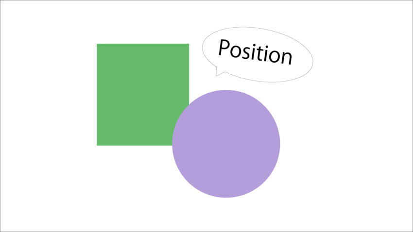
Do you know that CSS properties have a ‘position’?
This is a property for how to place HTML elements.
It is used when laying out the screen.
I think that the person who writes CSS has roughly used it or examined it.
However, when I started learning CSS, I had the impression that “I’m not sure understand about ‘position'”. When I modified without knowing it, the screen collapsed and I was impatient.
So this time I’m going to summarize how to use ‘position’.
After reading this, you should be free to use ‘position’.
There are 5 types of values that can be set for ‘position’.
There are currently five values available!
(CSS specifications may change, so they may increase over time.)
- static: Does not specify placement. Initial state.
- relative: Place in a relative position.
- absolute: Place it in an absolute position.
- fixed: Fix the position.
- sticky: Fix the position from the middle of the scroll.
Well, let’s see how to use each.
How to use “static”
‘static’ does not specify placement. It is in the same state as not writing ‘position’.
‘position’ is usually used in conjunction with ‘top’, ‘bottom’, ‘left’, and ‘right’ properties, but writing these properties has no effect when you specify ‘static’.
Let’s see.
HTML
<html>
   <head>
      <style>
         .box1 {
            width: 400px;
            height: 300px;
            background: lightblue;
         }
         .testbox {
            width: 100px;
            height: 100px;
            background: blue;
            position: static;
            top: 20px;
         }
      </style>
   </head>
   <body>
      <div class="box1">
         <div class="testbox"></div>
      </div>
   </body>
</html>
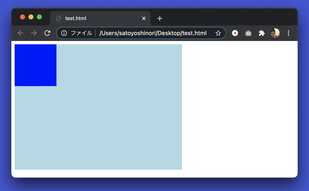
I placed a dark blue “testbox” in a light blue “box1”.
‘position’ is static, but this is the same arrangement without writing.
This is because HTML is usually placed in order from the top left of the parent element.
And I wrote a setting “20px” to the ‘top’ property, It means “20px” free from the base upper position, but this setting does not work because ‘position’ is “static”.
How to use “relative”
Let’s make the position “relative” for the source code above.
CSS
.testbox {
   width: 100px;
   height: 100px;
   background: blue;
   position: relative; ← changed this place.
   top: 20px;
}

The dark blue testbox has moved down a bit.
top: Evidence that 20px is working. I made 20px of space above where it was originally placed.
By the way, if you write another box that changed the color, it will be like this.
HTML
<div class="box1">
   <div class="testbox"></div>
   <div class="testbox2"></div>
</div>
CSS
.testbox2 {
   width: 100px;
   height: 100px;
   background: rgb(225, 0, 255);
   position: relative;
   left: 20px;
}
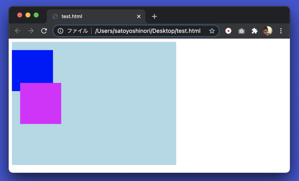
Purple testbox2 is available.
It’s the same relative box, but I removed the top:20px setting and added left: 20px;.
The left property is a property that sets how far you want to move from the base left position.
Originally, it is arranged in the same line as the blue box, but it is free for 20px.
And the blue box and the purple box are a little positional.
The purple box is placed in the reference position, while the blue box is “top: 20px;” Because it is 20px off the reference position below, the position of 20px is covered.
That’s it for relatives.
By the way, as for the reference
position, HTML has inline elements and block elements.
Inline elements are tags used, for example, for text written in HTML.
Block elements are box-like images used to make HTML elements into a single chunk.
Inline elements are placed from left to right.
Block elements are placed from top to bottom.
Overall, html is arranged from top left to bottom right in the order of written tags, but the way of placement changes slightly depending on the type of element.
This is the underlying way of placing in HTML.
Take a look at the sample below.
HTML
<body>
   <a href="#">Link highlighting</a> <strong></strong>

   <div class="testbox"></div>
   <p>paragraph</p>
   <span>Span tags are like div tags in inline element worlds</span>
   <div class="testbox"></div>
</body>
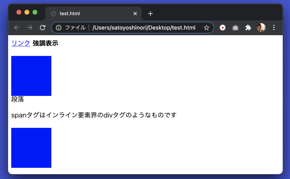
I mixed inline elements with block elements.
Both the a tag and the strong tag are inline elements.
Therefore, it is displayed side by side.
Next is the div tag, which is a block element, so it is placed under the inline element, and the next element is also placed below.
The next p tag is a block element, so the next element is placed below.
The following span tag is an inline element, but the next is a div tag that is a block element, so it is placed below.
Remembering the placement rules for inline and block elements in this way will help you lay out your web pages as you think.
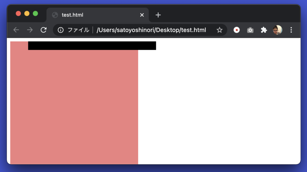
How to use “absolute”
The relative property is placed relative to each other, but absolute is placed in the absolute position.
Relative basically displays it at its base position, but absolute ignores it and places it where it is specified in the top/bottom/left/right property.
HTML
<html>
   <head>
      <style>
         .box1 {
            width: 300px;
            height: 300px;
            background: lightblue;
         }
         .box2 {
            width: 100px;
            height: 100px;
            background: blue;
            position: absolute;
            right: 0px;
         }
      </style>
   </head>
   <body>
      <div class="box1">
         <div class="box2"></div>
      </div>
   </body>
</html>
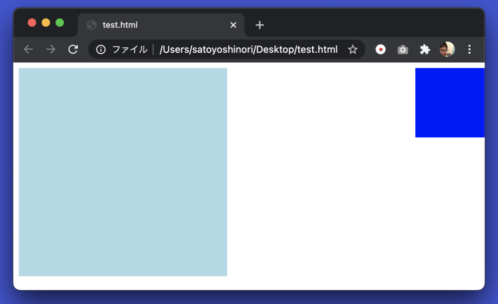
I placed a dark blue box2 in a light blue box1, but it is placed on the right edge of the browser by oversting box1.
This is the effect of absolute.
absolute is the reference position of the parent element who has a position that is set to anything other than static.
Box1, the parent element of box2, does not have a position.
In other words, the position is the same as static.
Therefore, box1 is ignored and its parent body tag, that is, the entire browser window, is the reference position.
Box2 has “right: 0px;” so it is 0px away from the right edge, that is, it is full of the right edge.
So what if you want to get to the right edge of box1?
Let’s make box1 relative.
CSS
.box1 {
   width: 300px;
   height: 300px;
   background: lightblue;
   position: relative;← this
}
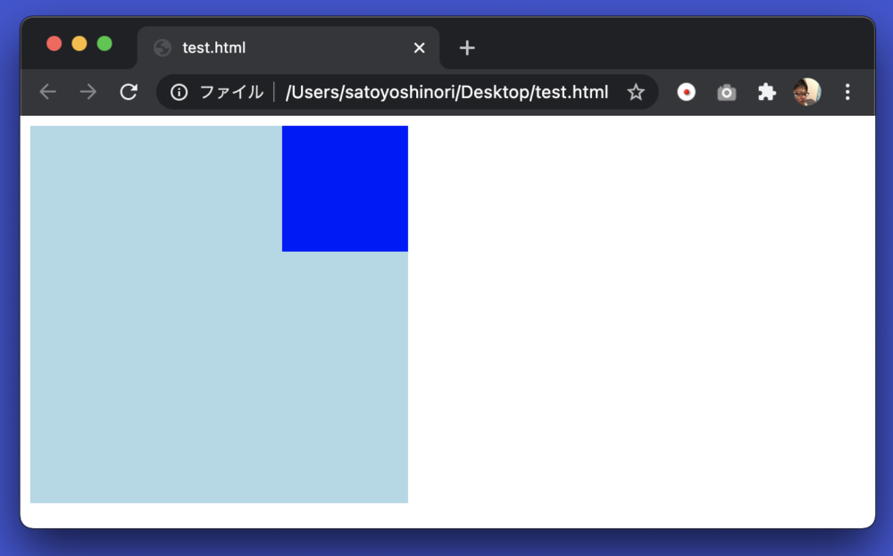
Box1 was placed at the right edge of box1.
Absolute may be surprised because it will be placed in an outrageous place if you do not check the condition of the parent element, but if it is not arranged as expected, let’s check the position of the parent element.
How to use “fixed”
Use the fixed property when you want to fix the placement.
Elements with fixed settings do not change their position no matter how much they scroll.
It is used when you want to create a fixed header.
HTML
<html>
   <head>
      <style>
         .box1 {
            width: 300px;
            height: 20px;
            background: black;
            position: fixed;
         }
         .box2 {
            width: 300px;
            height: 500px;
            background: lightcoral;
         }
         .box3 {
            width: 300px;
            height: 500px;
            background: lightgreen;
         }
      </style>
   </head>
   <body>
      <div class="box1"></div>
      <div class="box2"></div>
      <div class="box3"></div>
   </body>
</html>
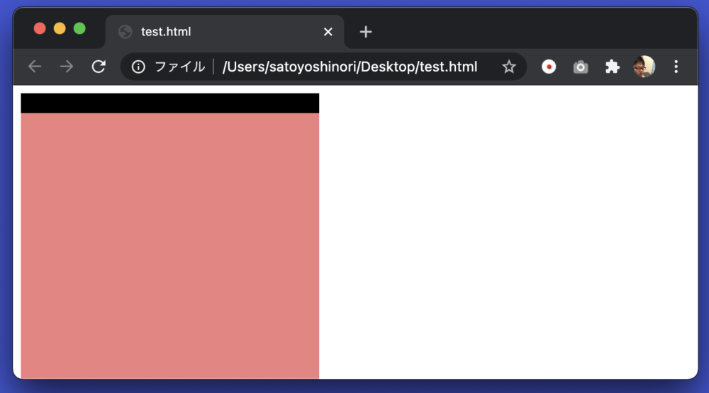
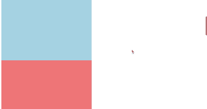
This time, I prepared box1 (black), 2 (red), and 3 (green).
position: fixed;” in box1 Is set.
Let’s scroll down the screen.
I scrolled to see the green box3, but the black box1 remains visible on the screen. You can see that it is fixed.
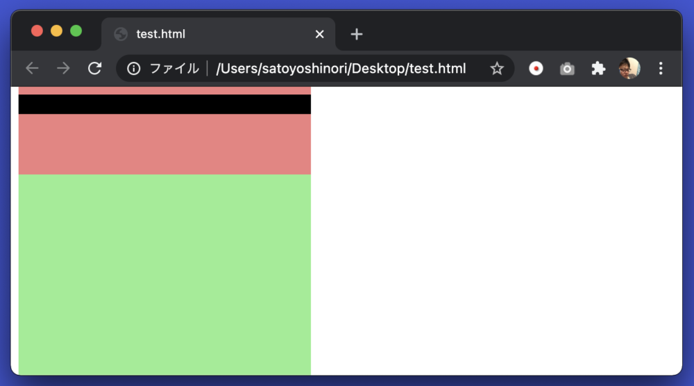
There are caveats. Let’s shift box1 a little to the right.
CSS
.box1 {
   width: 300px;
   height: 20px;
   background: black;
   position: fixed;
   left: 50px; ← add here
}
As you can see, box2 is eating into box1, so if there is content such as sentences here, it will not be visible hidden in box1.
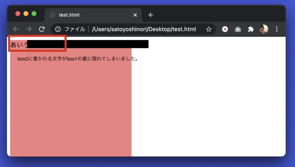
In to prevent this, it is important to take measures such as emptying the margins on the contents of box2.
For example, “padding-top: 20px;” in box2 to make 20px of space on top.
CSS
.box2 {
   width: 300px;
   height: 500px;
   background: lightcoral;
   padding-top: 20px;← added here
}
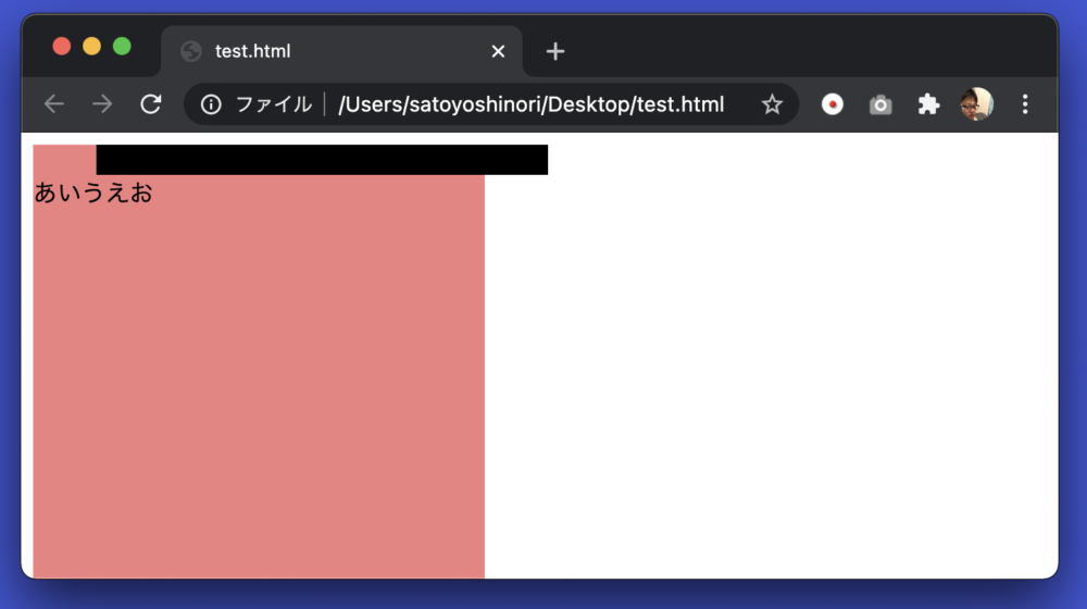
I had a margin on top, so the characters dropped down.
By the way, padding-top is a property that clears a margin on the top of the contents of the box.
How to use “sticky”
Fixed was a property that fixed the display position even when scrolling.
Another fixed property is sticky.
This is a property that scrolls and lands when it comes to the specified position.
Let’s see.
HTML
<html>
   <head>
      <style>
         .box1 {
            width: 300px;
            height: 500px;
            background: lightblue;
         }
         .box2 {
            width: 300px;
            height: 500px;
            background: lightcoral;
         }
         .box3 {
            width: 300px;
            height: 50px;
            background: black;
            position: sticky;
            top: 100px;
         }
      </style>
   </head>
   <body>
      <div class="box1"></div>
      <div class="box2"></div>
      <div class="box3"></div>
      <div class="box1"></div>
      <div class="box2"></div>
   </body>
</html>
We have prepared 5 div tags of 3 types.
Sticky was set for the black box3 in the middle.
“top: 50px” is also set.
As you can see from the video above, when I scrolled and saw a black box, the position was fixed 50px away from the top.
Sticky is sometimes seen in the sidebar of a blog site.
If you don’t want the content to flow by scrolling, you can try using it.
Summary
This introduces how to use the position property.
Did you understand somehow?
It is quick to actually write to learn how to use it. Please give it a try if you like.
Shitakke!
- Positions include static, relative, absolute, fixed, and sticky.
- When using position, use the “top”, “bottom”, “left”, and “right” properties to decide the position to display.
- Static is the same as not writing position. Properties such as top do not work.
- Relative displays at the same position as static, but you can modify the position with properties such as top.
- absolute can specify an absolute position relative to the upper left of the relative parent element.
- Fixed secures the position.
- Sticky secures its position in the middle of scrolling.
本格的にプログラミングを学びたいですか?ITのエンジニアになりたいですか?
IT業界は万年人手不足であり、ニーズがあります。
パソコンとインターネットがあれば場所を問わず仕事ができるので、リモートワークが普及しつつある現代にマッチした職種と言えると思いますし、
物理的に必要なものはパソコンぐらいなので初期投資にかかる費用も少なく、人並みに仕事ができればフリーランスになって会社依存を脱却することもできます。
身につけた技術は一生モノです。
もし本腰を入れて勉強したいという方はスクールに入るのも一つの手です。
いくつか紹介しますので、興味があればサイトを覗いてみてください。
TechAcademy
最短4週間で未経験からプロを育てるオンライン完結のスクールです。 どこかに通う必要なく、自宅でもプログラミングやアプリ開発を学ぶことができます。
TechAcademyのサイトへ
Want to learn programming in earnest? Want to be an IT engineer?
The IT industry is understaffed for many years and has needs.
If you have a computer and the Internet, you can work anywhere,
so I think it can be said that it is a job type that matches the present age when remote work is becoming widespread.
The initial investment cost is low, and if you can work like a normal person, you can become freelance and get rid of your dependence on the company.
The skills that you have acquired is something that will last a lifetime.
If you want to study in earnest, you can go to school.
I will introduce some of them, so if you are interested, please take a look at the site.
DMM WEBCAMP
This is a programming school for those who are serious about changing jobs. guarantee a job change, so it is recommended for those who are inexperienced and are looking for a job change in the IT industry!
move to DMM WEBCAMP
TechAcademy
It is an online school that trains professionals from inexperienced in a minimum of 4 weeks. You can learn programming and app development at home without having to go anywhere.
move to TechAcademy